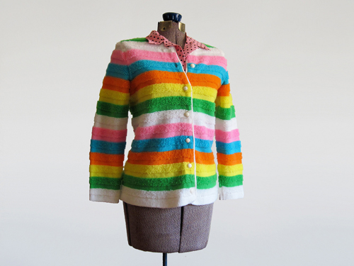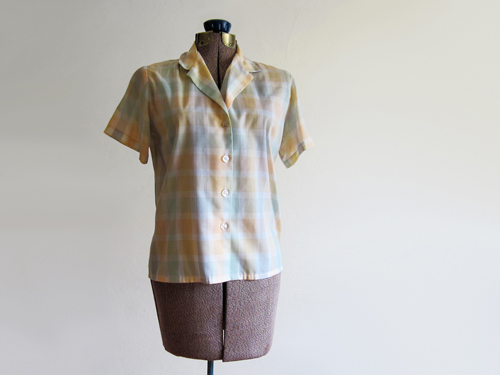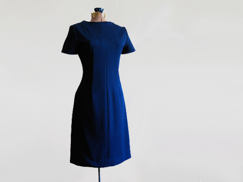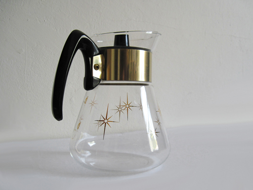
As part of our continuing efforts to demystify the labor process--be it vintage selling or academic writing--we've decided to include for you today the raw, un-'shopped images of some of the newest items in the shop. While we don't have any fancy studio equipment (e.g., lighting kits, seamless backdrop papers) or even a big white wall uninterrupted by so much pre-war crown molding, we do have nice natural light and enough college newspaper-cultivated post-production skills to convincingly mimic these things. (And once we figure out how to make our broke-down Acme dress form look like a tall, starving, dead-behind-the-eyes teen girl with a contrived pigeon toe, our impersonation of the pros will be officially complete.)
So step on up and pull back the proverbial curtain on our humble shop floor by mousing over the images. Oh, and if you're wondering why everything is so crooked in the originals, it's because the floor in this old house has more dips than a French sandwich shop.


6 comments:
great pictures! Love the design of your blog.
Really cool. I wish I was a better photoshopper.
That was really neat. My photos are always crooked, too. I thought it was ME that was a little off, but I'm totally going to blame the house now :)
i love me a good french dip.
but then i won't look like a starving teen girl. humpf.
I love this! Your photos turn out so well, it was nice to see before & afters. Every house in Buffalo dips, so I feel you on the crooked pictures. I am lucky to have a big white wall, but I spend half of my editing attempt to cover the plaster marks.
oh great, now everyone is going to know about the 18 rubbermaid totes and 12 baskets of laundry that are about to topple down onto my unsuspecting 3 ft. spot of wall that acts as a backdrop...
...i was really enjoying the mental farce of having a big huge studio. well, when the flying monkeys show up, i'm sending them all your way.
- L.
Post a Comment